Managing Forms in Vivaldi
Learn how to build, configure, and customize responsive Table, Detail, and Master-Detail web forms for MySQL.
Typical Form Design Process
← Previous: General Settings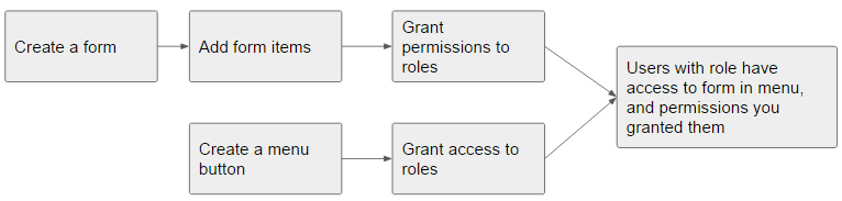
Example Forms
Pre-built example table and detail forms are available in Vivaldi to demonstrate common configuration and design techniques. Access them anytime by navigating to Administration > Examples from the top application menu.
Creating Forms
Vivaldi provides three primary form architectures to support database workflows:
1. Table Forms
Tabular views displaying rows of records with support for search, sorting, filtering, and export. You can link a related Detail form to handle record add, edit, or view operations, and control delete/export permissions. We recommend building your Table form first, then using 'Copy items to Related Detail form' to speed up your Detail form layout.
2. Detail Forms
Single-record views rendered within a responsive modal dialog. Detail forms accommodate extensive data fields, file/image uploads, grouped panels, and custom validation.
3. Master-Detail Forms
A compound view featuring a top-level tabular form ("master") paired with child forms arranged across bottom tabs. When a user selects a master record row, child tabs automatically filter to show associated records. Learn more about Master-Detail setup →
New Form Wizard Steps
- 1 Navigate to Forms > New Form Wizard in the menu.
- 2 Enter the form name, select the target MySQL table/view, specify the primary key, and choose your form type.
- 3 Vivaldi generates the scaffolding automatically, allowing you to proceed directly to the Form Designer.
Designing Your Form
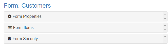
The Form Designer workspace is organized into three left-hand panels: Properties, Items, and Permissions.
Preview your live forms or toggle full-screen designer mode at any time using the control buttons on the top right:

Adding Items to Your Form
Easily bind text inputs, dropdowns, upload controls, and buttons to your MySQL database columns. Ensure that both paired Table and Detail forms contain a field with Primary Key set to "Yes" (this field can be hidden from view if desired).
- 1 Click New in the Form Items panel.
- 2 Choose the target form in the dropdown.
- 3 Provide a user caption and select the bound column in the Bound Field input.
- 4 For Table forms, use Table Display Order to set column positions. For Detail forms, set the Detail Row and Detail Column coordinates (e.g., Row 1: 2 columns; Row 2: 1 column).
- 5 In Detail forms, group fields into collapsible accordions by setting a matching Collapse Panel name.
- 6 In Table forms, tuck secondary fields into expandable sub-rows by enabling the Show in row expand section? option.
Field Display Types & Options
Specify the Bound Field to map directly to your MySQL table columns. Data is saved as entered. Click the Wizard icon next to Display Format to apply date, time, or numerical masks.
Tip: Add the custom CSS class clearafteradd to reset fields when a user submits via "Save and Add Another".
Add the CSS class chosen-select to enable live keyword searching within large dropdown menus. Supported list formats include:
- Yes/No & True/False: Automatically maps boolean selections to
1and0. - Table/Key/Text Lookup: Format as
TableName;KeyColumn;DisplayColumn(e.g.,tblCustomers;CustomerID;Customer Name). You can append an optional SQLWHEREclause (e.g.,...;IsActive = 1). - Key/Text Static List: Semicolon-delimited pairs (e.g.,
1;Florida;2;Georgia;3;Nova Scotia). - Built-in Functions: Use
fGetCountryListfor countries orfGetStateListfor US states.

Cascading Dropdowns
To filter a child dropdown based on a parent selection (e.g., selecting a Company filters the Employee list), set the Dropdown Parent property on the child field and specify the foreign key in the Child Filter column.
Place custom buttons on Table or Detail forms to trigger workflow logic. Use the Click Event Wizard or input custom JavaScript in the Click Event property. Use Form Help to attach hover tooltips.
Detail Form Lifecycle Events
Execute custom JavaScript logic at specific stages of form interaction. Ensure statements end with a semicolon (;):
- Before Save: Triggered before inserting or updating. Use
return false;to abort the operation. - Before Delete: Triggered before deleting. Use
return false;to abort. - After Read: Triggered once data is fetched from the server.
- After Insert / After Edit / After Delete: Triggered following successful database operations.
Dynamic Default Values
Populate fields automatically at runtime using dynamic system keywords:
Current User– The username of the logged-in session.Current Date– Current system date (yyyy-mm-dd).Current Datetime– Current timestamp formatted to the user's timezone.
Calculated Fields & Table Expressions
Define client-side calculated fields in Table forms using the row.FieldName notation. Standard JavaScript methods like .toFixed() and conditional statements are fully supported:
// Arithmetic calculation
row.ItemPrice * row.Quantity

// Conditional logic
if (row.Quantity == 4) { return 'Special Order'; } else { return 'Standard'; }

// Dynamic anchor hyperlink
'<a href="//yourdomain.com/orders/' + row.OrderID + '">' + row.CustomerName + '</a>'
Displaying Images
To display images dynamically from a URL, configure the display type as Calculation and reference the stored file path:
if (row.Image_1 != '') {
    return '<img src="//yourdomain.com/' + row.Image_1 + '" style="max-height:35px;" />';
} else {
    return '';
}
If your database column contains the complete, absolute URL to the asset, select the Image (display) display type directly.
Advanced Table Features
Inline Editing
Enable in-place spreadsheet-style editing for text, number, and date columns:
- 1 Check Inline Editing in Form Properties.
- 2 Set non-editable fields to Read Only in Form Item Properties.
- 3 In Form Properties > Table Options, enable Disable Scroller (Scroller and Inline Editing cannot run concurrently).
CSS Utility Classes for Table Columns
tablelink– Renders column content as an underlined, clickable link.truncate-sm/truncate/truncate-lg/truncate-xl– Truncates text at 15, 30, 45, or 150 characters with full text accessible via hover tooltip.col-centered– Centers column text alignment.
Configuring Permissions & Security
Control granular CRUD access (View, Insert, Edit, Delete) across user roles via the Permissions panel. Note: Form-level settings take precedence – if a form has Delete disabled globally, individual role permissions cannot override it.
